

Welcome to my very first map making tutorial, where I’ll try to explain my workflow, methods to create a map as well as some tips and insights.
NB if you are totally new to QGIS or GIS in general, maybe this is not the right tutorial for you. I don’t do anything super technical but a basic knowledge of QGIS is required
The tutorial will be split in two, to adress what I think are the two main steps in the map making process : creating the base map layer and secondly, adding the text, labels, additionnal data, illustrations etc. (this will be another tutorial). In some cases, depending on the data you want to show, creating the basemap will take a very long time while in other cases, it is going to be much easier. It is highly variable. Now, let’s see what are the main steps and challenges we have to tackle when doing a basemap.
1 - the basemap will be the backbone (I dare even say the base) of your map. You need to think in advance and anticipate the final result when you do it, because the rest will depend on it.


Double click on the raster, select “histogram”. you can zoom in too. It allows to see the data distribution on the raster. It helps choosing the right value for your rendering
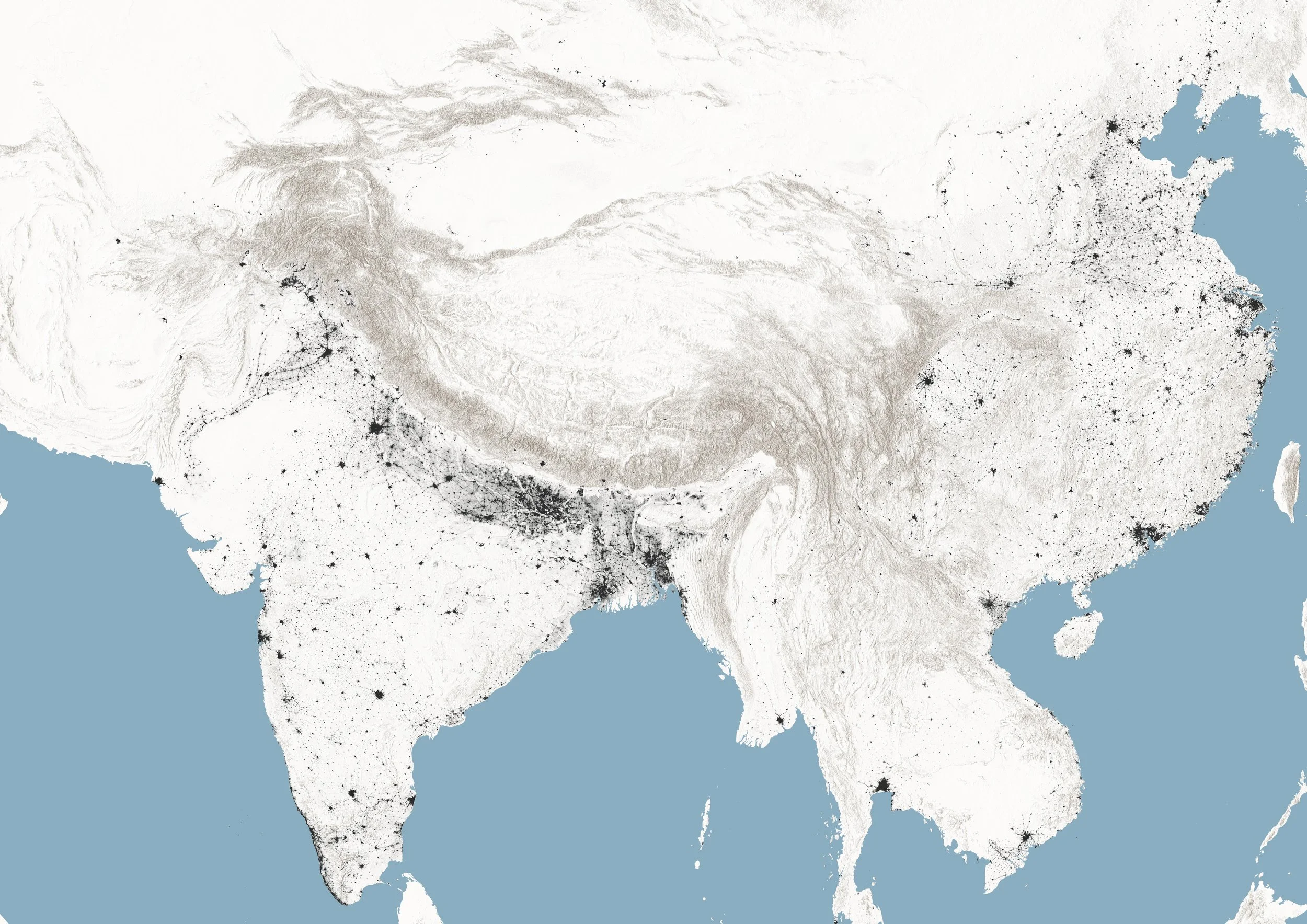
Here is the map I am going to take as an example for the basemap making. As you can see in this final version, there’s a lot of text, a diagram, a key and even a minimap. If these are thing you want to have in the final result, you have to think about it and create the basemap accordingly, to let some room, negative space, for it. Otherwise, you’ll waste time and keep creating new basemaps, making tiny steps. Try to draw on a sheet of paper the way the map will look like, the land mass AND the text blocks, illustrations, graphs and such.
2- The second very important thing, is what you will include in the basemap. A natural answer would be (in that case) : the ocean, landmass, cultivated areas, glaciers, rivers, borders, population density. Everything except text and illustration basically. It’s a little tricky. What I find the most convenient, by far, is creating a basemap like this one, that seems to lack some of the important data we want to show :
There’s a lot less here and it might seem counter intuitive but trust me, you’ll find it much more convenient and logical. The logic is that you only keep the raster layers (here : population density, hillshade) and some very basic shapefile such as landmass and oceans, as long as there’s no contour line. Why is that ?
Let’s say you have turned on the vector layers in QGIS and chose a certain value for the line thickness, a certain colour etc. Once you export the basemap as an image file, these visual settings are baked in the image and after you have swtiched to illustrator for the next part, you don’t have any control on how that random line or point looks like. So you are … stuck. And have to make a new image. Let alone these times when you deal with fjords or the Bangladesh coastline. That’s why I only keep the raster data and very basic vector data (like landmass, based on my experience, there are fewer chances you change your mind about how it looks like). Generally, very intricate vector layers are better left for Illustrator, which makes you able to micromanage a given portion of the border and change the thickness so it looks nicer

This makes me feel anxious.
3 - These first two steps were technical but the third one is more straight forward. In a few words, make it beautiful ! Beauty is highly subjective but some general tips won’t hurt.
Generally, I try to choose pastel, light colours and try to make them match with each other. To do that, I look at maps on the web and try to see what works well, what I like, what colour palette looks good. Googling is free so don’t feel shy spending half an hour looking for a beautiful map you want to get inspiration from. That’s really how you build your own style in the end (hasn’t happened for me but you know …)
Generally, some “aesthetic principles” I have are the following :
Go for light colours. Don’t use pure black but instead, dark grey. Choose the right projection so that your map is not distorted towards the poles. I think white as a major colour works well, it makes it more legible and it is a safer option as well, it makes the rest more legible. When dealing with rasters, it’s important to find the right palette with the right thresholds. See my map about the great barrier reef in which the bathymetric file has a wide range of value but I went for a palette allowing the see the shallow areas only.
To sum it up, before you start the actual GIS and illustration work, draw your map on a sheet of paper (a schematic version of it I mean, or go for the full hand painted map if you feel like) and try to arrange elements, information, text boxes and landmass. Secondly, think of the data you will include in the base map, and the data you’ll keep for later, just to have things organized.
Moving forward …
Now, the technical part ! When you open QGIS (I use QGIS but you can do the same with Arcmap) and start a project, the first thing I do is to add an online basemap layer with the Quick Map Service plugin (first red circle). You can add satellite imagery, elevation, hillshade, many more …. I also tend to add the world boundaries by typing “world” in the coordinates box and pressing “enter”. It can be helpful since it gives a geographical reference point.
A few examples :
In the first image, the google satellite imagery with the countries borders (it’s a shapefile that you can save and then modify).
In the second image, a hillshade layer, that I use in nearly all my maps ! NB : layers from QMS are not raster layers you can save. They also require an internet connection to load


Now, you should have something that can be used as a basemap. Depending on the data you want, the steps I have mentionned here might be more challenging, sometimes you have to do some vector or raster processing to get it to work. For instance, I had to use the “polygonize” tool on the cultivated areas, because I downloaded it as a raster at first. You also may have to create a shapefile by hand if you’re doing something very specific. GIS skills will help here
When you’re ready to export the file, turn everything off in the layer pannel, again, except the countries basemap and go on “project” then “new map layout”. It’s in landscape mod by default, but by right clicking on the canvas, and clicking on “ page property”, a tab will open on the right. There, you can select “portrait” if you like.

Then, you select this tool (see the image) which is on the left and drag your mouse to fill the white canvas with it. Your data will appear. The rendering is slow so it’s better to first get the framing right before adding the raster files, which make it slower (it will refresh many times, whenever you’ll move the frame). You can move the frame by clicking on the icon with the four arrows, same tool box as before. You can also adjust the zoom level by scrolling while pressing the control key for a more precise level
Once the framing and composition are OK, go on the project and turn on the layers you’ll keep for the basemap. Click again on the map layout canvas to refesh the image and then, go in the layout menu (the upper menu) and click on “export as an image”. Choose a name and the resolution you want. 300 dpi (dots per inch) is fine most of the time but the higher it is, the most freedom you’ll have to work with the image later (you can crop etc.) 1000 dpi is excellent, certainly too much, and QGIS can crash so be cautious and gentle with your computer. I haven’t been very nice with mine :)
You have your basemap layer now, great, but what about the rest of the data ? I am happy you asked, because if you stop there, you’re going to miss a big step. Go back on your QGIS project, turn on the layers that were turned off (it doesn’t matter if they look ugly) and conversely, turn off those you had for the basemap. Go on the map layout again, and most importantly, don’t move the frame or change the zoom level, this is important.


Now, it’s time to add to add all the data you want in the final map. Drag and drop files.
It’s supposed to be a little messy. Here are :
the HKH region boundary, the major rivers, the agricultural areas, the population density (the big black square) and the glaciers.
Let’s start by turning off all layers except the population density, to make it look good, and the world boundaries (which give a reference point)
The reason why the raster is black is because black = low values and white = values. You can maybe see tiny white spots, that’s where cities are. Just double click on the raster and go to “symbology” and then choose “pseudo colour”.
Choose the grey scale and make the 0 look white (and then set the opacity to 0 by clicking on the white square), and lastly set the maximum to a value that works for your map, here 2000 but I found it after some trial and error. Basically, The sweet spot is where the black only shows areas that fit what you’re map is telling. I didn’t want mine to look to cluttered but still wanted to put some stress of human settlements. If you want to keep it subtle, try 4000, or more, if your map is only about population density, choose 1000. Same applies to other type of data of course !
The raster looks good. It’s time now to turn on the hillshade layer (from the QMS seach box) and create a temporary shapefile for the ocean (basically just a very large polygon you place underneath everything else and colour in blue)
You’ll notice that the hillshade is not transparent. To fix this, double click on the layer, and select “multiply” in the “rendering” box. You can also click on the transparency tab to make it a little more subtle. 60% is fine : that’s what I did for my map.

Export again, but this time, as a SVG file (just below the “export as an image”). The SVG file is a vector file and having a SVG version of your data will allow you to directly use it Illustrator / Inkscape. Trust me, when I found out I could do this, I was truly euphoric. It’s such a life hack. Yes, life hack, maps are life.

After following all these steps, you normally have a nice basemap and vector data you will import in the vector drawing software, to make it overlap with you image, which allows you to start your map right away. I will show you the next step in another turorial and try to give tips and insights.
Overall, I hope this tutorial could help and bring some light on how I do it (It’s only my workflow, so please leave a comment if you don’t agree of think it can be improved).
Keep in mind a considerable amount of time is often spent looking for the data and doing some GIS (vector, raster) processing on it because data rarely comes fresh out of the oven for you to make a map out of it. I had to merge the population density for different countries, vectorize the raster landcover file to extract the cultivated areas, delete rivers from the file I initially downloaded AND also messed with the buffer tool to create a replica of the HKH boundaries because for some reason, this particular layer didn’t export correctly in the SVG format ! So, be patient and have fun making maps !
Links below to some useful website for data :
GEBCO Global bathymetry and elevation data
Mapchart : allow you to try out some projections, helps identifying them
A tutorial on how to create a globe like projection
Natural Earth : various raster data (elevation, bathymetry) and graticules
Diva GIS : data for any country. This is the GOAT. really convenient. Not so precise for ultra high scale maps though
SRTM tile grabber (elevation tiles)
Population density raster
link 1
link 2 (higher spatial resolution, for each country)
The one and only USGS Glovis to download satellite data
Please, let me know if you have useful ideas or links I could include here.